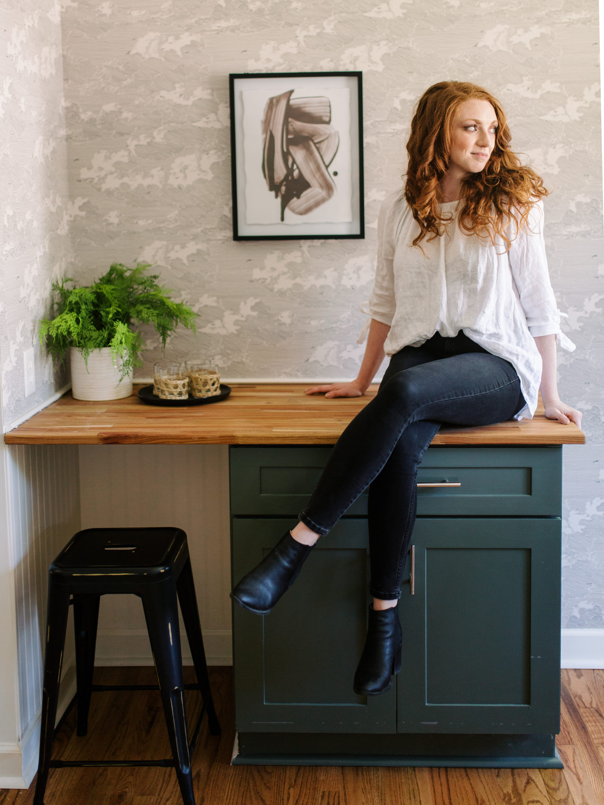
Modern Nashville Cottage Renovation Dining Room & Kitchen Tour
September 3, 2020
Well, y’all, the stock tank pool is taking longer than I anticipated… I’ll save the gory details for a post once it’s done, but let me just tell you something that every second grader already knows: rain and fresh paint do not mix well. And a little bonus knowledge nugget for ya: even when the primer says it dries to the touch in 30 minutes, plan on giving yourself more than a couple hours of time before you know it’s supposed to downpour.
Anywho, let’s just focus on a project that IS done, completed, checked off the list, and sold! Our Green Hills House project sold earlier this summer, and over the next couple weeks I’m going to be sharing the final lovely details and tours with you. Today we’ll start with some wallpaper and butcherblock in the dining room and kitchen. In case you missed the “before”, click here.
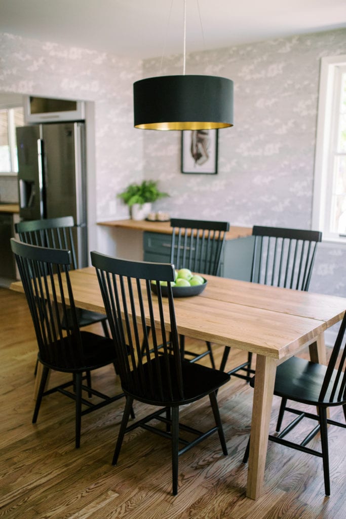
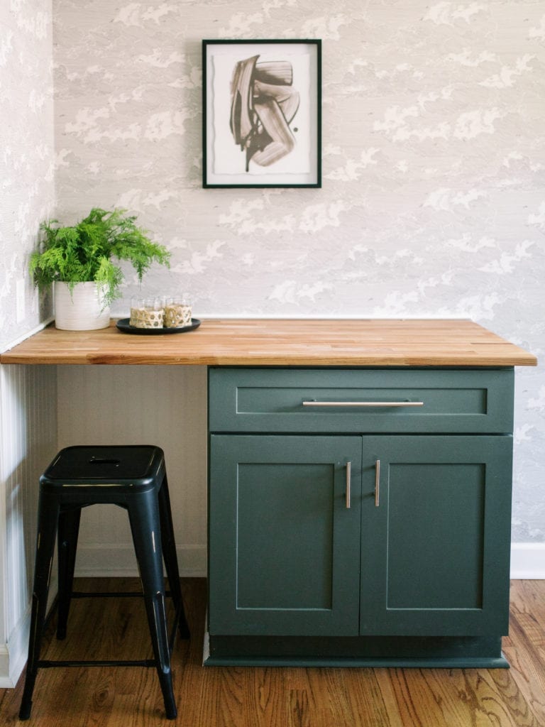
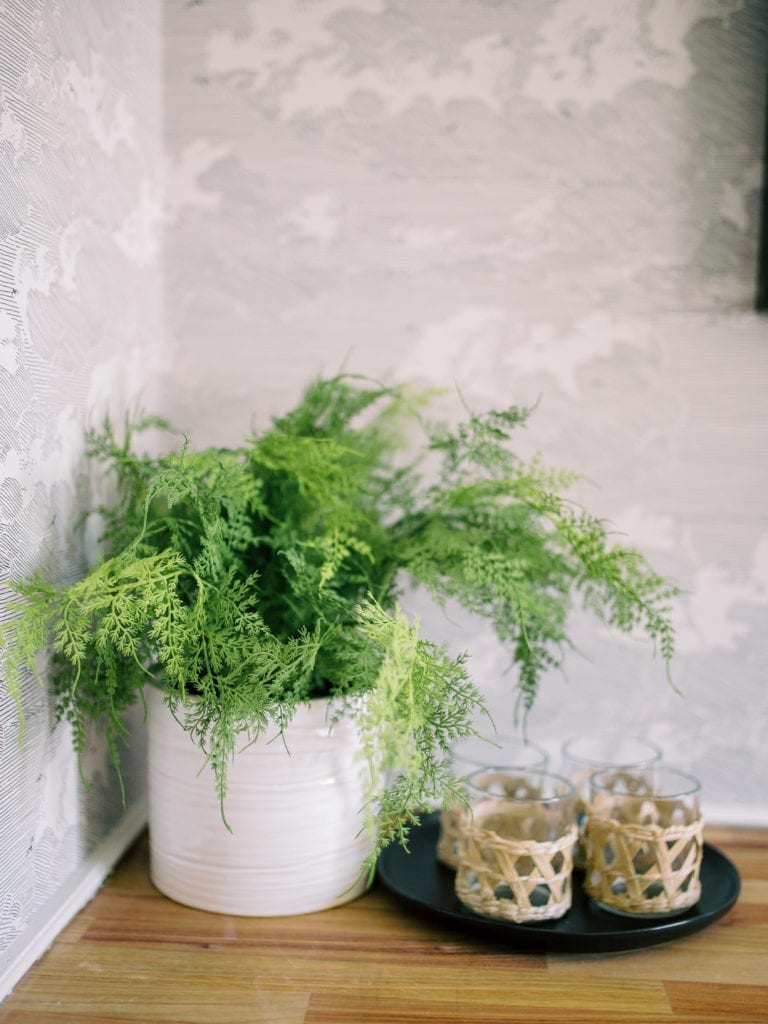
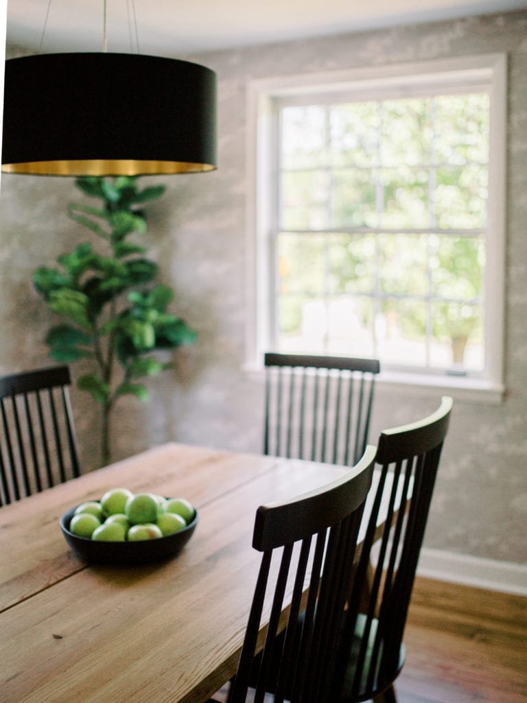
For this dining room, I really wanted to keep the color palette mostly neutral, but since we were planning originally on keeping this as a mens’ luxury sober living house, I wanted it to have a more masculine feel than my style tends to lean in my own home. I fell in love with this wallpaper from Anthropologie, but fell out of love with the pricetag. Luckily (and this is a hack you can use for just about any product, but especially wallpaper), I was able to google the style and product numbers and find it for a bargain elsewhere. Win-win! I got my wallpaper, AND I saved money.
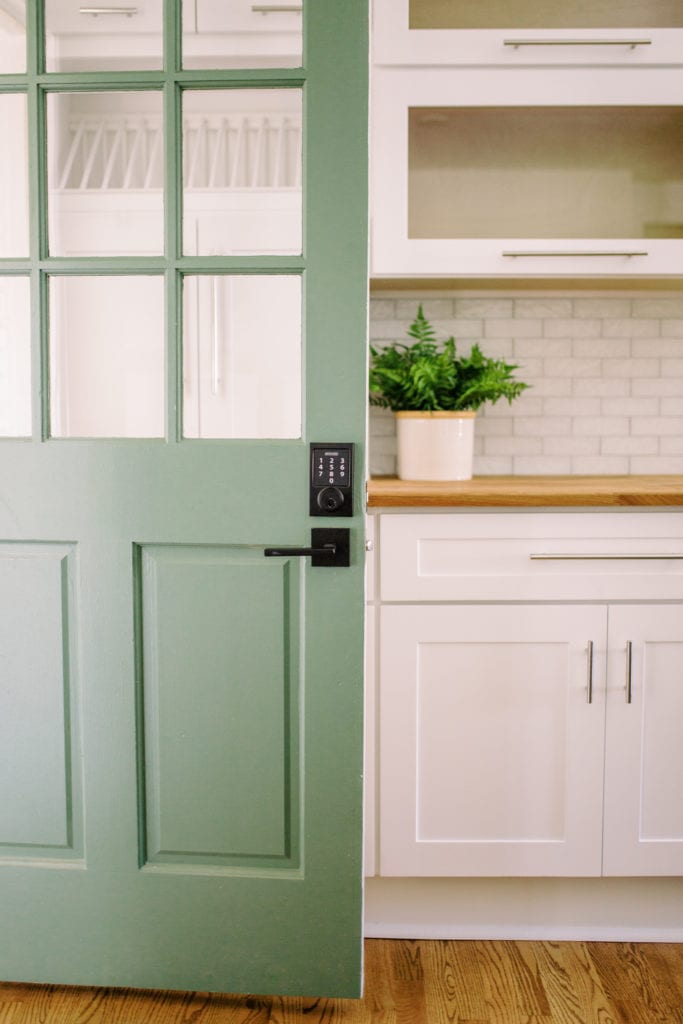
We brought in the deep, muted green (clearly a theme for me) from the front door and the kitchen island by painting this built-in bar area. The beautiful table is from Article, the chairs are from World Market, and the light is from AllModern. I’m thrilled with the modern but still warm feel of this room, and even more thrilled with how affordable it all was.
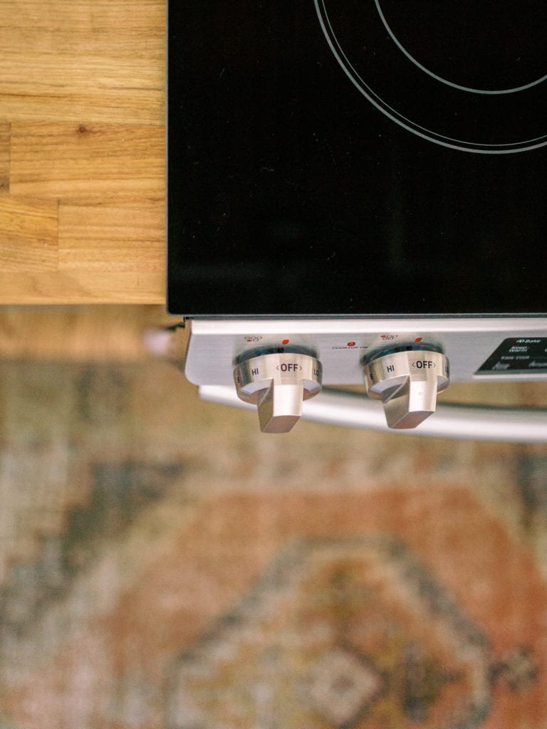
The kitchen was mostly re-done before we got to it, but there were some elements that absolutely HAD to go, the first being what became known as “the big ugly red thing”, the steampunk-esque light fixtures, and the pale bamboo floors. There was also just one small section of this blue and white tile backsplash that didn’t match the rest of the subway tile backsplash, and had brushed nickel schluter, which is one of my personal major dislikes, especially in a backsplash. Some people love it, but I think it draws your eye to the edges of the tile and stands out too much.
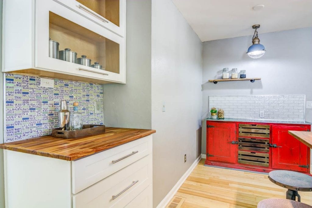
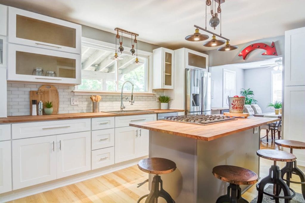
Bamboo floors in and of themselves are not horrible, and in the right place they can be really perfect. But when the rest of the house has beautiful original red oak floors, they stand out and look very yellow.
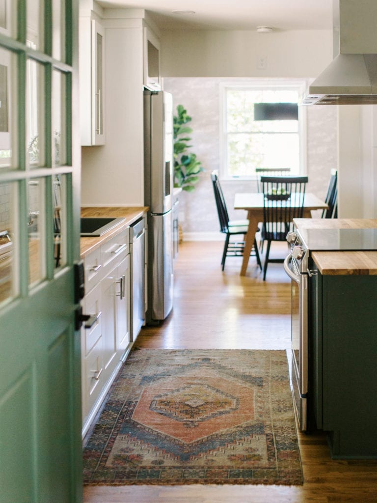
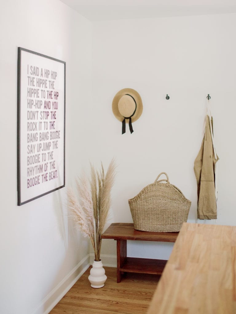
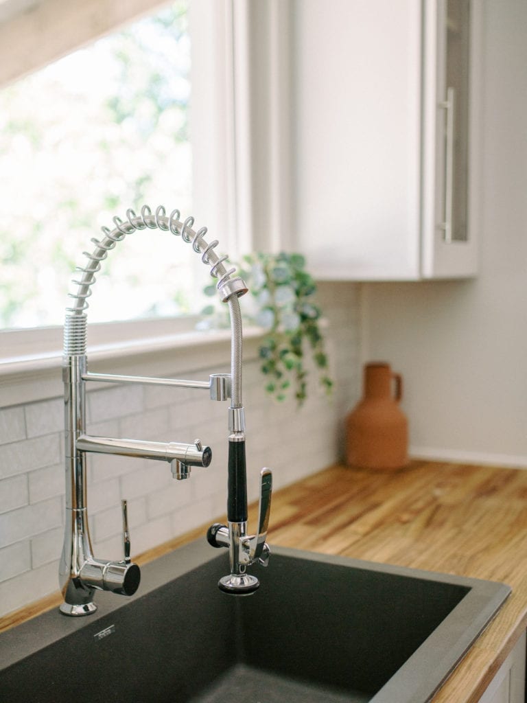
Our contractor matched the original floors beautifully, and the white paint made this room feel so much brighter and bigger.
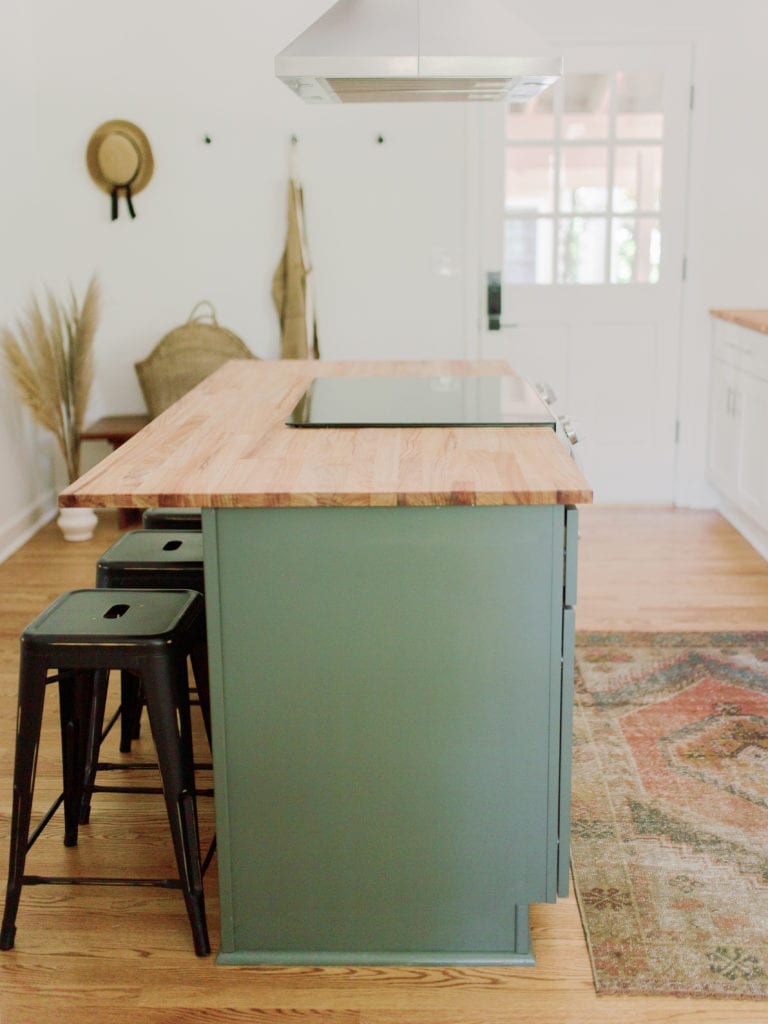
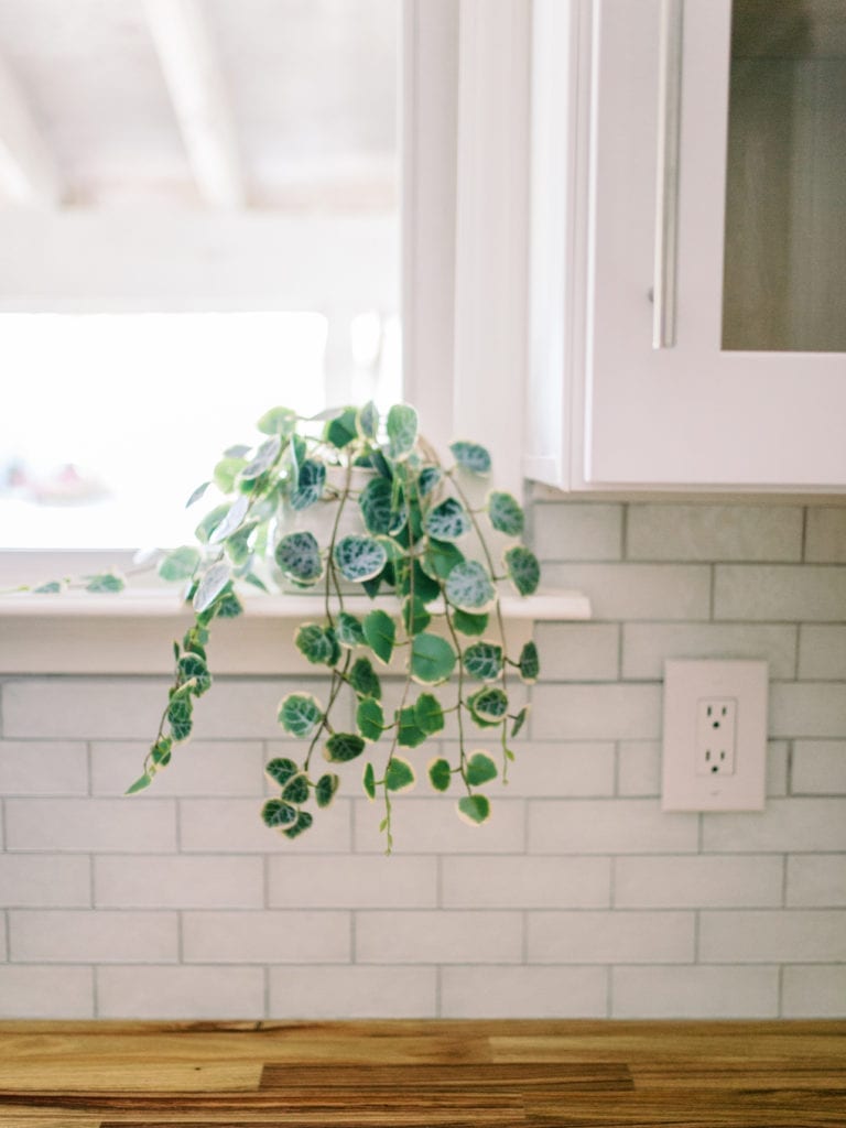
I hope you’ve enjoyed this kitchen and dining tour. I’ve got a couple more from this house for you, so stay tuned!

Grace
All photos by Sarah Nichole Photography
Leave a Reply Cancel reply
For even more content, sign up for my newsletter. I share weekly recaps so you won’t miss anything, as well as personal notes and answers to your questions. Sign up here! I promise I’ll never sell your information or spam you with unsolicited emails.