
The Carriage House Bathroom
September 14, 2023
This title is a little misleading, because I’ve already shared the details of all of our hardware from Signature Hardware in this blog, which included the bathroom fixtures. But I’d be remiss if I didn’t dedicate an entire blog post to my favorite room in the carriage house, the bathroom.
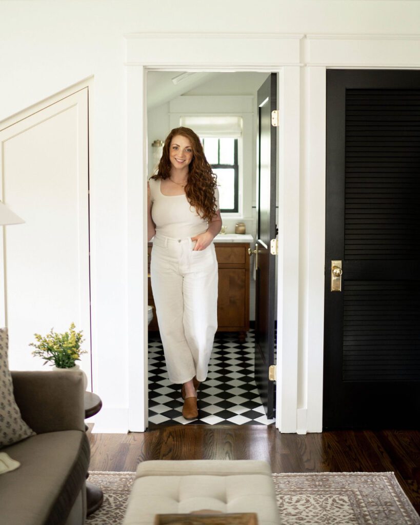
Our main house was built in 1926, and I wanted the carriage house to “go” with it. Oftentimes I see people building carriage houses (super common in our neighborhood) that are super modern compared to their old craftsman bungalows, and it makes me a little bit sad.
We planned for this space to be both a guest house for friends and family to come visit and a short term rental (AirBnb) investment property, so when I was designing spaces, I was balancing durability, aesthetics, and cost in my decision making.
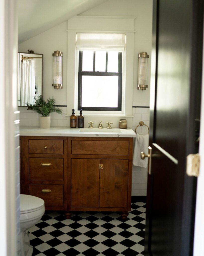
I love using simple materials in unique ways to make an affordable statement, which is exactly what I did with this wall tile design. The field tile is just a basic 3×6 white subway tile from The Home Depot, in a basic brick pattern. We like ordering tile for small projects from The Home Depot because you can return individual tiles, so if you don’t use them all, you don’t have a lot of wasted tile or expense. To give the walls even more of a “historic house” feel, I wrapped the tile all the way around the room, added a black pencil and base tile, and avoided using any schluter (the metal border you’ll often see around modern tile). I prefer beveled or curved tiles to schluter anyway, especially in a space where I’m trying to make historically inspired design choices.
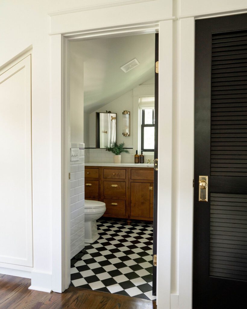
The floor tile was so hard to find. It’s next to impossible to find a smaller scale square, matte tile that’s floor rated. I was SO excited to find this exclusively at Stone Source, and loved how it looked once installed… but then, the painters left a paint can there for a while while touch-up paint was being done, and now there’s a rust stain that’s impossible to get out. The matte finish really attracts dirt and is hard to clean, so keep that in mind if you’re thinking about a similar floor.
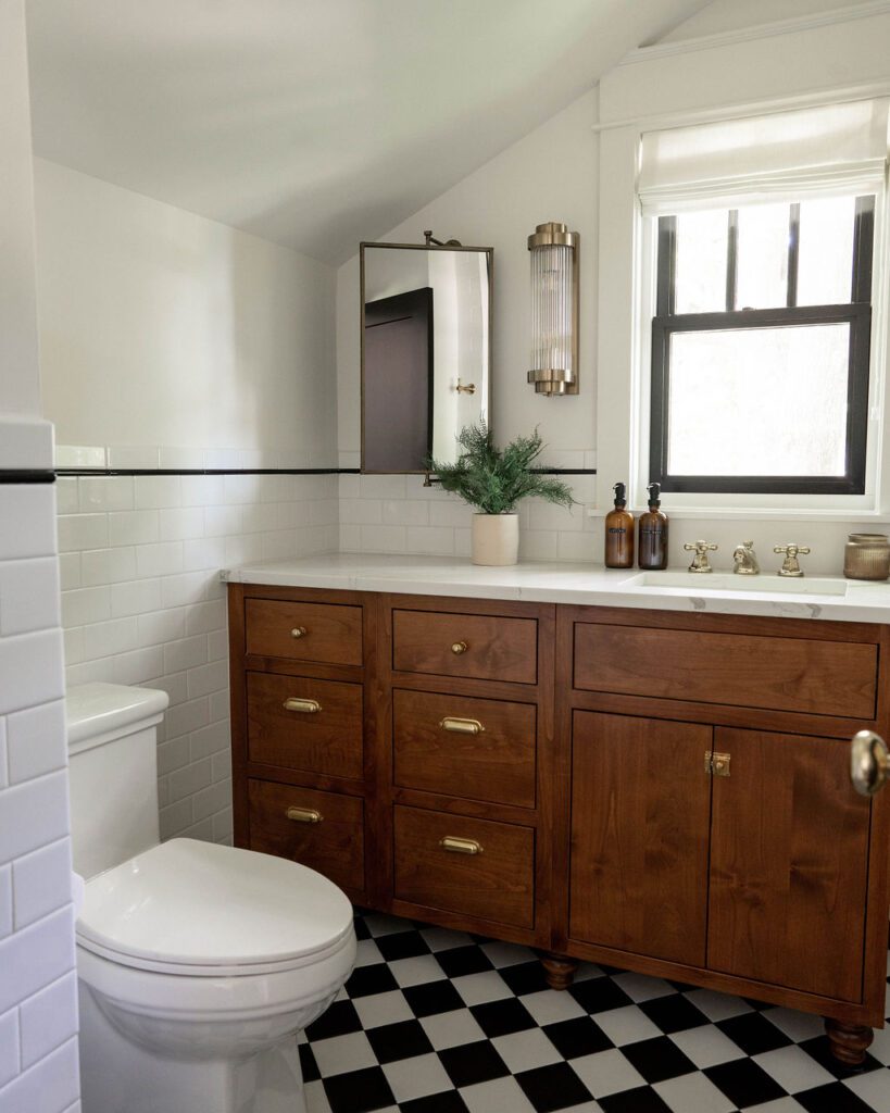
You may remember that Jonny and I (mostly Jonny, let’s be honest) DIY-ed a dresser into a vanity for our Fall 2021 One Room Challenge in our guest bathroom. I wanted a similar feel here–I like how the warm wood tone contrasts with and softens the clean lines and colors of the tile. Since this is a unique space with a sloped ceiling, we needed an offset sink and pretty specific measurements to get the look I wanted, and opted to have a custom vanity built to fit the space perfectly.
The vanity countertop is the same as the kitchen, a quartz with natural looking greige veining.
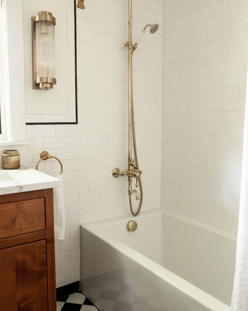
You may be wondering if I knew there would be a window here when I chose the sink placement. Yes! One of the most important things in any bathroom is making the people who use it feel good, and good lighting is the easiest way to do that. Everyone looks better lit from the side than above, so the natural lighting and sconces are intentionally placed to make everyone who uses this space look and feel good. The mirror can swivel, so you can still stand in front of the sink and look at your pretty face.
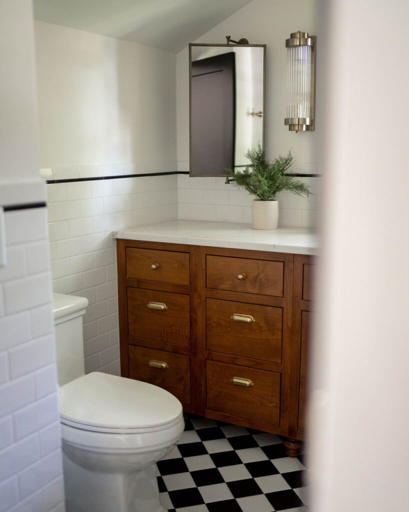
Speaking of the sconces, these are some of my favorites I’ve ever used. If you look closely you can see that the glass isn’t reeded, it’s individual rods of glass placed close together to give the appearance of reeded glass. They’re so cozy and unique. You can find them here.
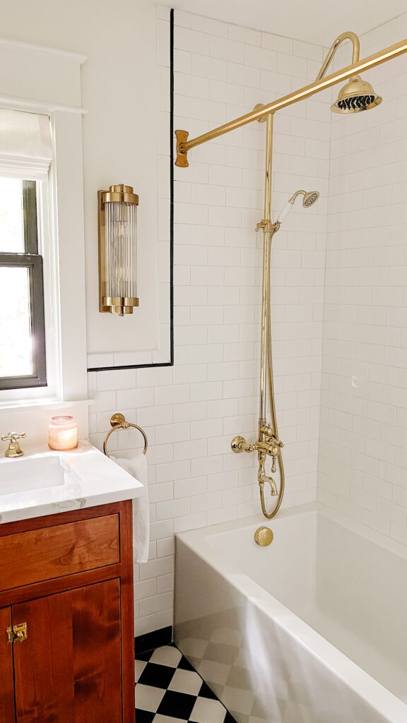
I’ve already waxed poetic about how much I love the plumbing fixtures in the carriage house, but I’ll do it again here! The tub is so deep, and I’ve definitely come out here to take baths a few times (before we were using it as an Airbnb–don’t worry, I’m not that creepy). The exposed piping of the shower fixture lends this room a historic feel. I strongly considered putting in a clawfoot tub, but for the sake of keeping things clean and low-maintenance, I’m glad we went this route.
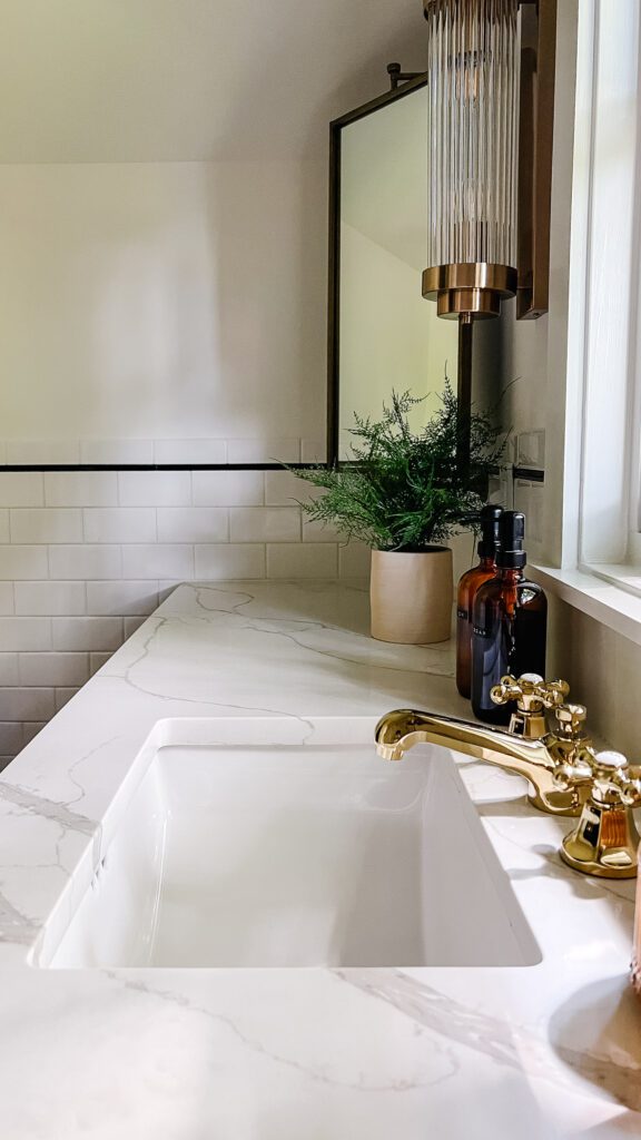
The sink faucet is the same one I used in our guest bathroom from Signature Hardware, but in polished brass. If unlacquered brass had been an option, I would have taken it. Realistically, with how many people are in and out of this space since it’s being used as an Airbnb, it’s probably for the best that it has a more durable finish (though I will always love anything with an authentic patina!)
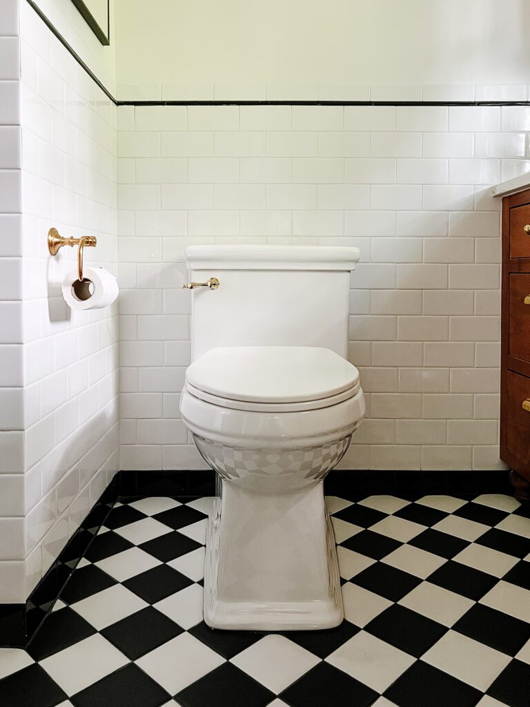
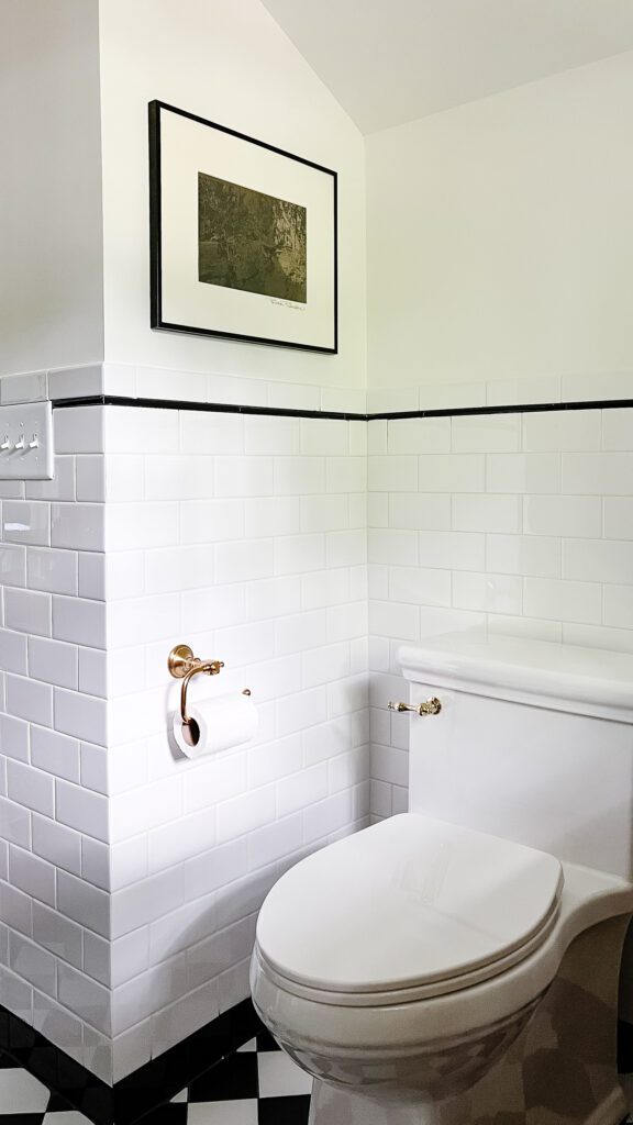
Last but not least, we can’t forget about the toilet! Have you ever seen a prettier toilet? This is something I didn’t realize made a difference until I started designing for renovations. Upgrading a toilet has a ton of impact, and choosing a good one for a new build is equally important.
There you have it, folks, my favorite room in the carriage house! Except maybe the kitchen… Another post on that at another time.
xo
Grace
This post may contain affiliate links. Thanks for your support!
Leave a Reply Cancel reply
For even more content, sign up for my newsletter. I share weekly recaps so you won’t miss anything, as well as personal notes and answers to your questions. Sign up here! I promise I’ll never sell your information or spam you with unsolicited emails.