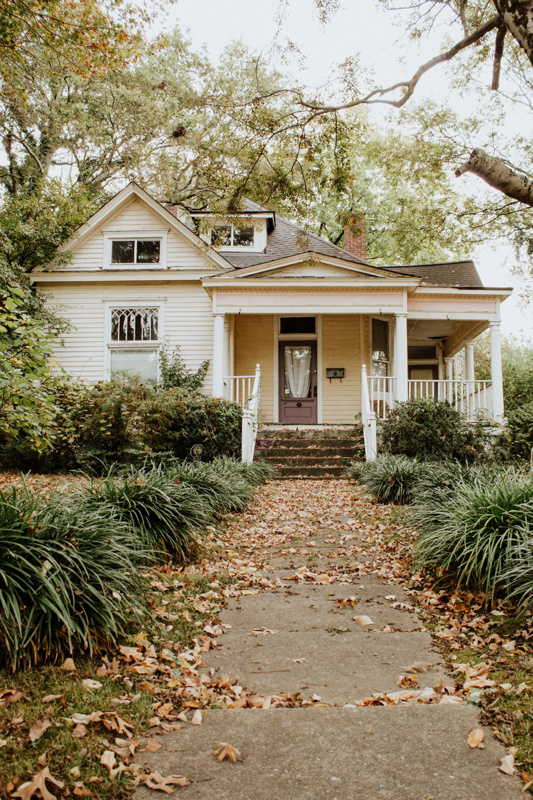
We’re Renovating a Victorian House! Meet Ruby.
January 15, 2021
Happy 2021, y’all! This post has been a year coming. I started working on getting this house under contract last January, and it feels SO good to be able to share it with you now. Isn’t it funny how this may be your first time hearing about this project, so it’s brand new to you, but I’ve already spent a whole year working on it? Crazy. You wouldn’t have wanted to be here for the back and forth, waiting, following up, logistics, cleaning out the house, and so on and so on. So I suppose it’s best that this is your first formal introduction.
A little back story:
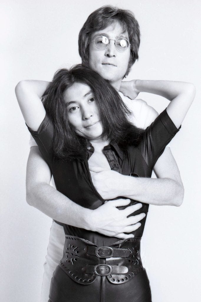
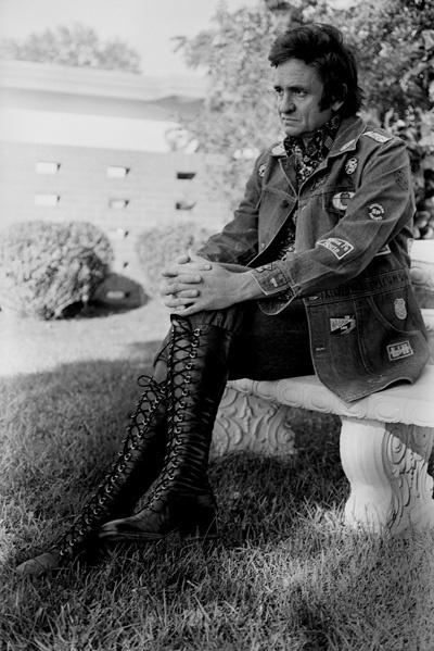
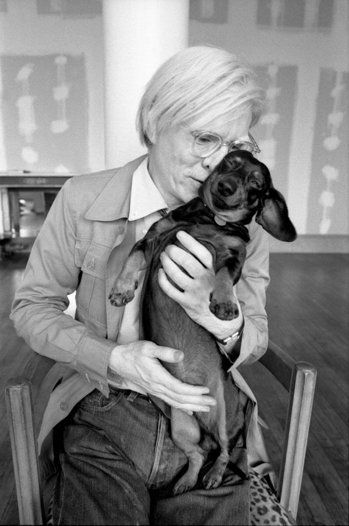
This house’s most recent owner and occupant was Raeanne Rubenstein. She was an iconic music photographer, and I’m sure you’ll recognize some of her work. She was Nashville’s go-to country music photographer in the 70s and 80s, as well as one of the only photographers Andy Warhol would allow to take his photographs. I wish we had gotten the chance to know her before she passed away in 2019, because wow–what a legacy! She was an art collector, and we’re keeping some of her collection with the house for the next owner. Needless to say, this house has some amazing history, and if it could talk, I’m sure it would have great stories to tell about Raeanne’s life there over the 20 years she owned it. In homage to Raeanne Rubenstein, we’ve named this project the Ruby Project.
All four photos above are Raeanne Rubenstein’s work, courtesy of NYTimes.com, NPR.org
This house is located in East Nashville, and is in a historic neighborhood conservation overlay. That means that the changes we make to the exterior have to go through the Metro Nashville Historic Zoning Commission. For the past three months since we closed on the house in October, we’ve been going back and forth with our architect and MNHZC (here on out I’ll just refer to them as Historic Zoning). If it sounds like a headache, it can be, but we still enjoy it. Jonny and I both love historic homes, bringing them back to life, and giving them a fresh perspective. There’s just something about a house with history and soul and imperfections and a whole-house patina that you just can’t get from something built within the last 70 years.
Our neighbor is a historical archivist, and she was able to help us trace back the ownership history to 1912, which leads us to believe the house was built between 1910 and 1912. That fits with the Late Victorian architecture, which doesn’t quite match the surrounding 1920s craftsman bungalows. It’s also on a corner lot that’s a good bit larger than the neighboring homes–another sign that this house is older than its neighbors.
Now, on to the real reason you’re here: before photos! For the walkthrough tour, click here.
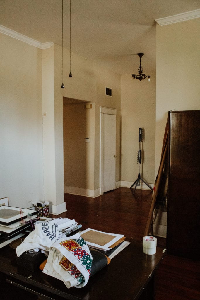
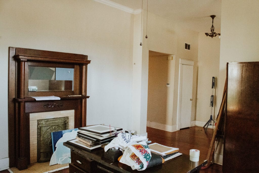
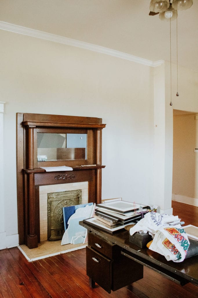
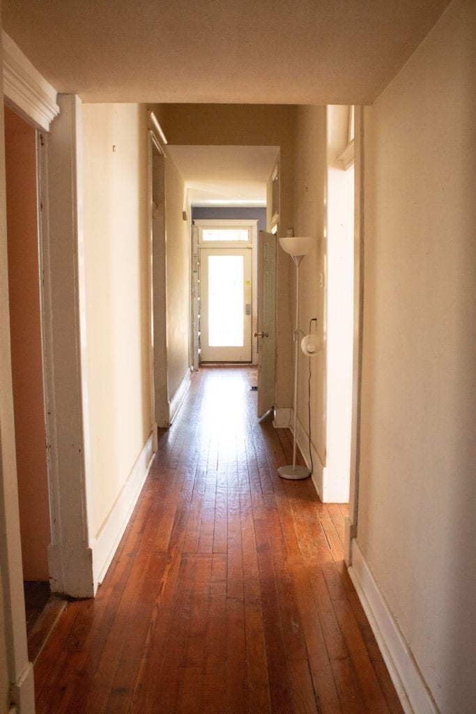
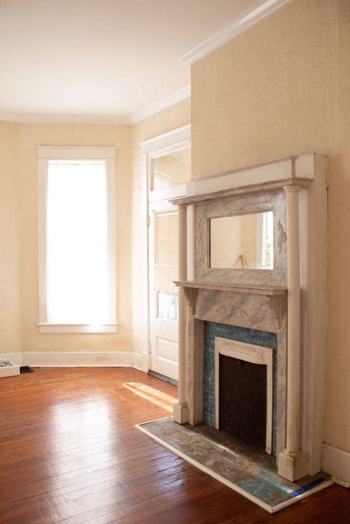
The living room sits right off the entryway. Eleven foot ceilings make this home feel larger and grander, and the extra tall windows add a lot of light and beauty to the space.
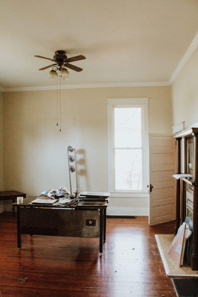
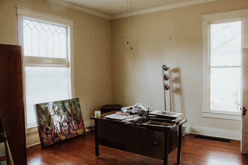
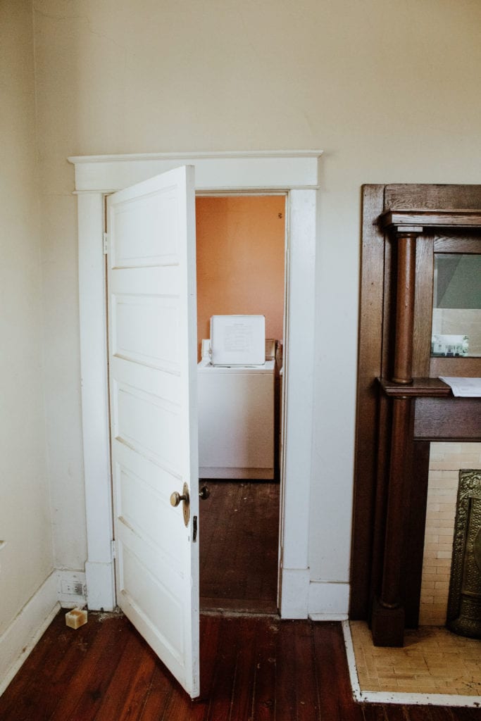
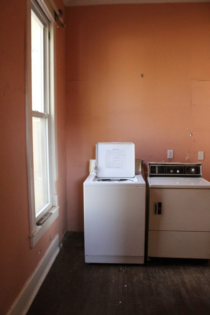
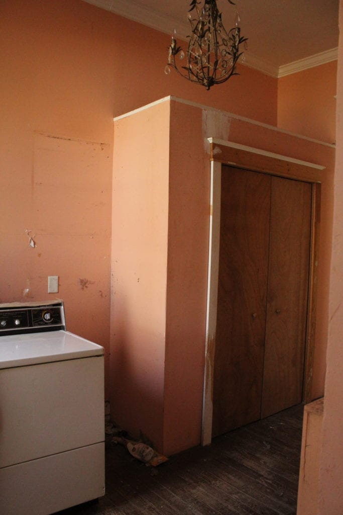
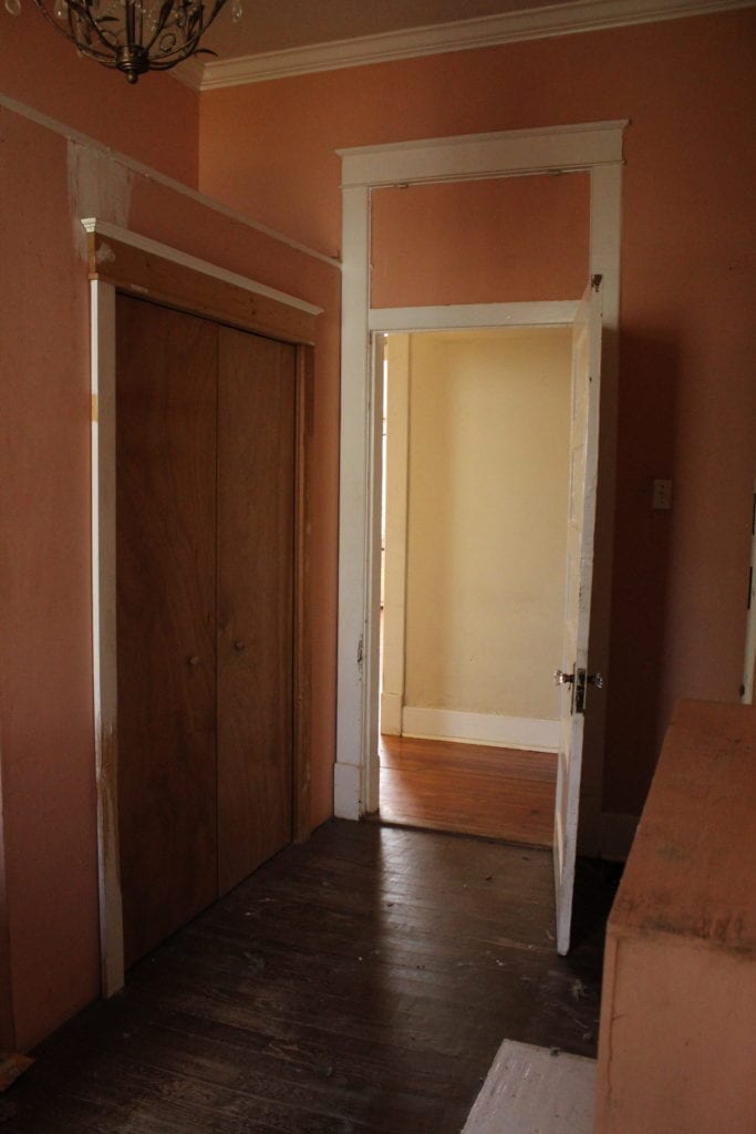
Currently a large and oddly placed laundry room, this peach room will have both doors removed, a door added behind where the dryer is currently leading into the primary bedroom, and will become the primary bathroom. Right now I’m picturing a free standing cast iron tub in front of exposed brick where that fireplace is walled up.
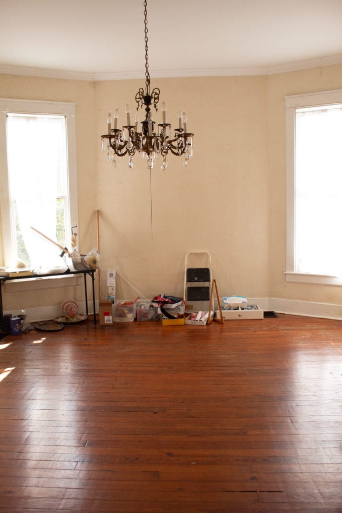
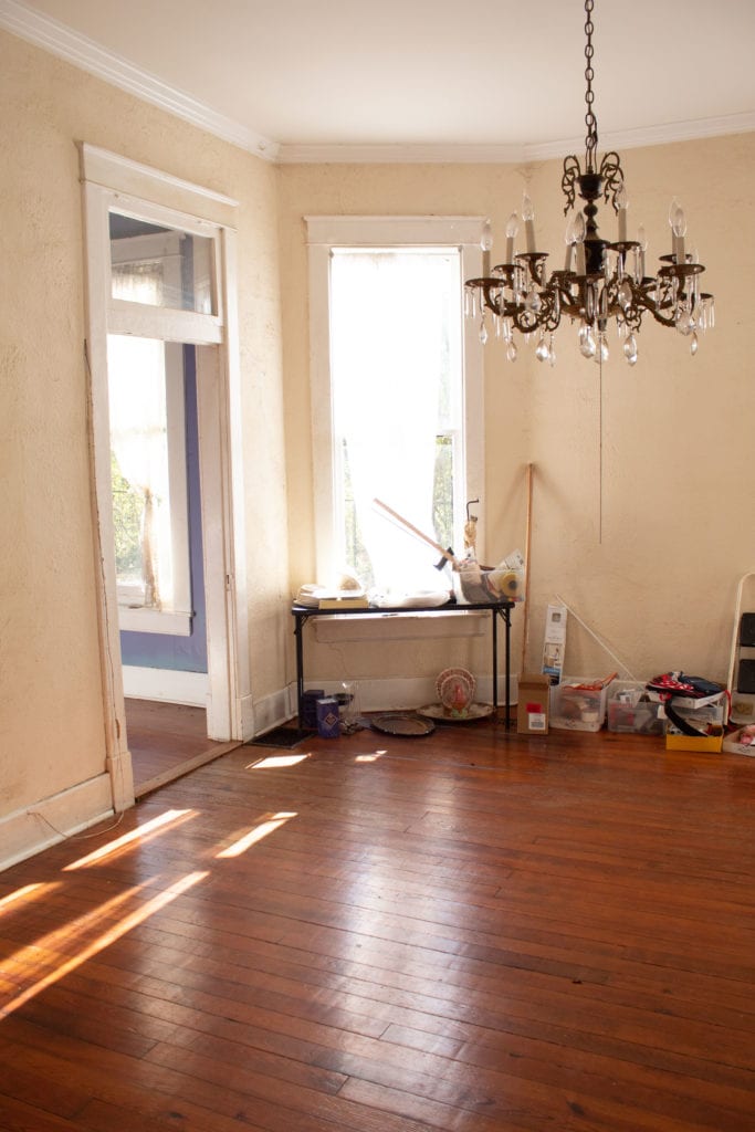
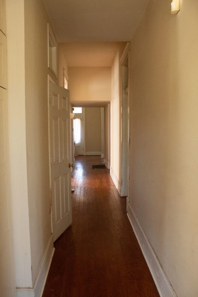
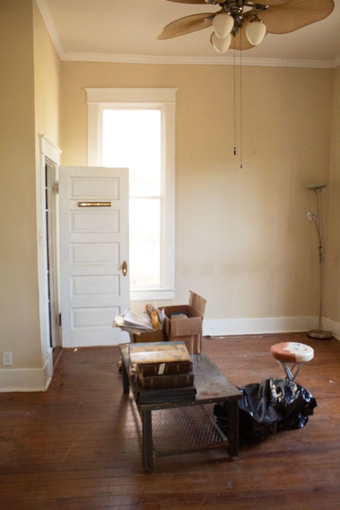
Back down the hall and into the dining room, which will stay a dining room!
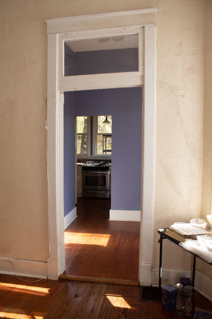
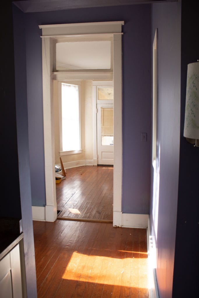
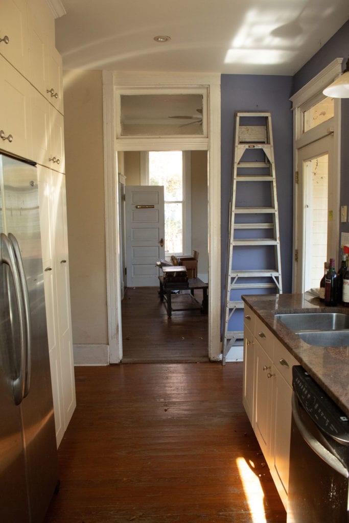
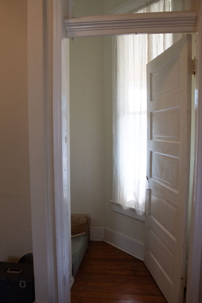
This strange little room has an actual window on the left that looks in on the only downstairs bath. This will turn into a butler’s pantry between the kitchen and dining room, and the bathroom will be taken out–no communal restroom experiences here. I know you’re shocked I’d ever dream of removing such a feature.
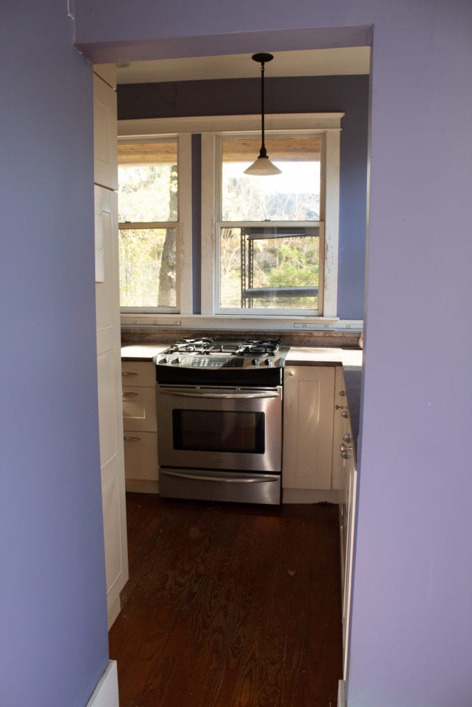
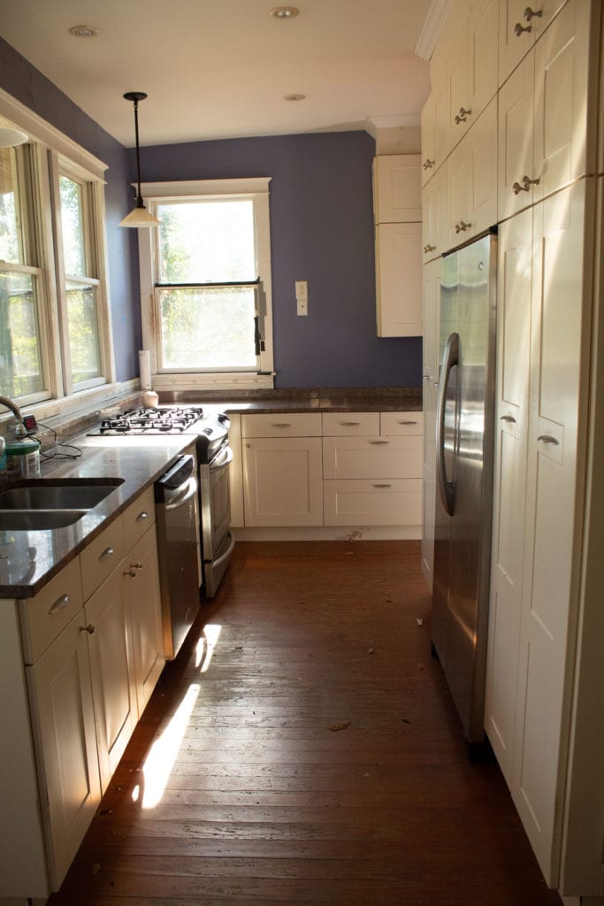
The kitchen is small, so removing that bathroom will give us a lot more room for a large island, as well as a walk-in pantry, and a new spot for the staircase. We’ll also be expanding this back wall of windows into the back yard about 4 feet.
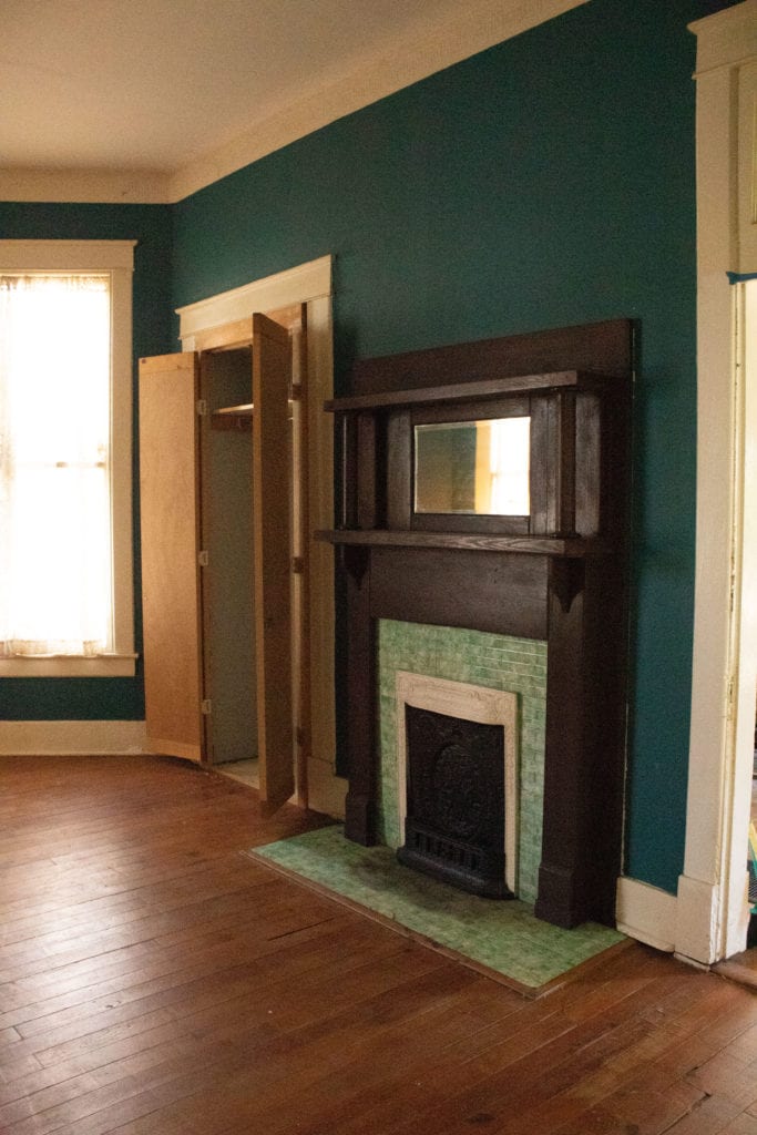
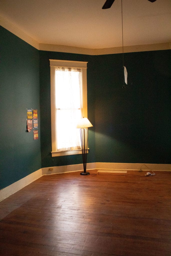
This cream colored room will stay a bedroom, but will also extend off the back of the house to make room for a new laundry room and an en suite bathroom. The teal room will be the new primary bedroom, with the current laundry room turning into the primary bath.
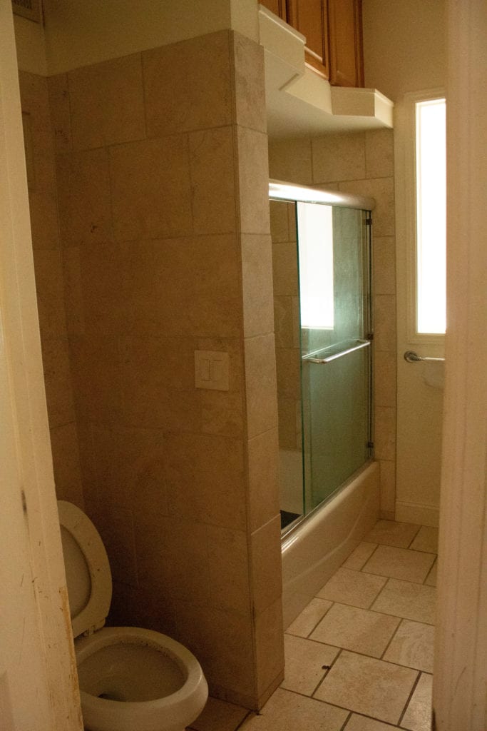
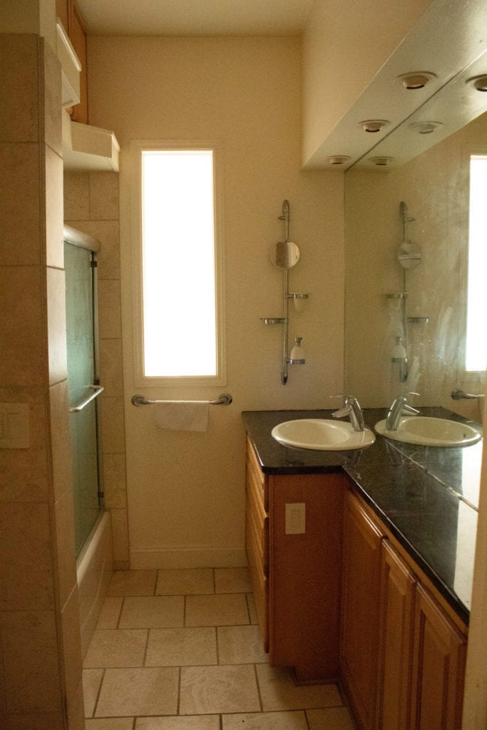
There’s so much happening in this bathroom. The whole wall mirror, the skinny/pointless countertop, the cabinets above the shower that are eleven feet in the air… not to mention the excessive use of travertine. Now that travertine is coming back into style, maybe I should keep it… or maybe not.
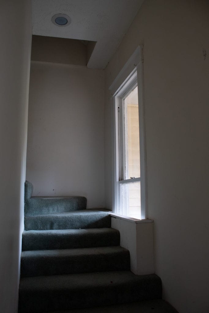
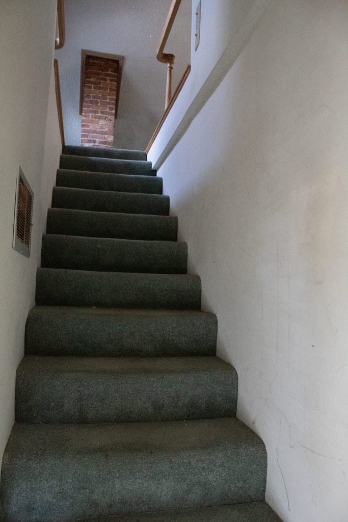
Time to go upstairs! The upstairs was an attic, and a previous owner (possibly Raeanne Rubenstein, possibly someone before her) finished it out and built these stairs right by the front door. These will be demolished to allow the hallway to return to its eleven foot ceiling height. They’re also wildly unsafe–we’ve got no railing, no stringers at the top, and you can’t really tell in the photo, but they’re very steep and extremely narrow. Just asking for an accident here.
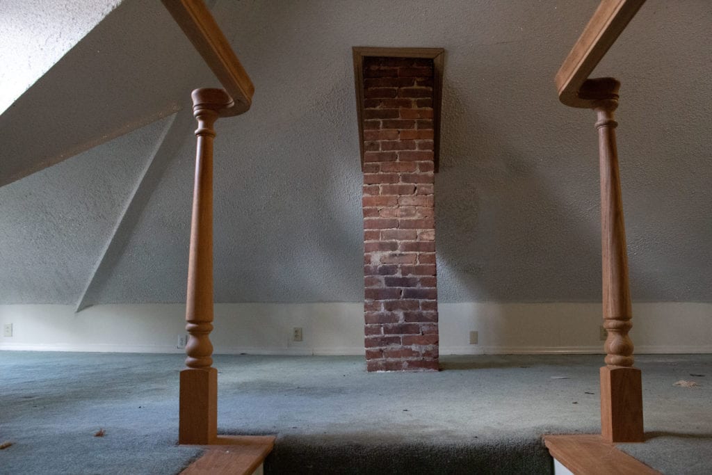
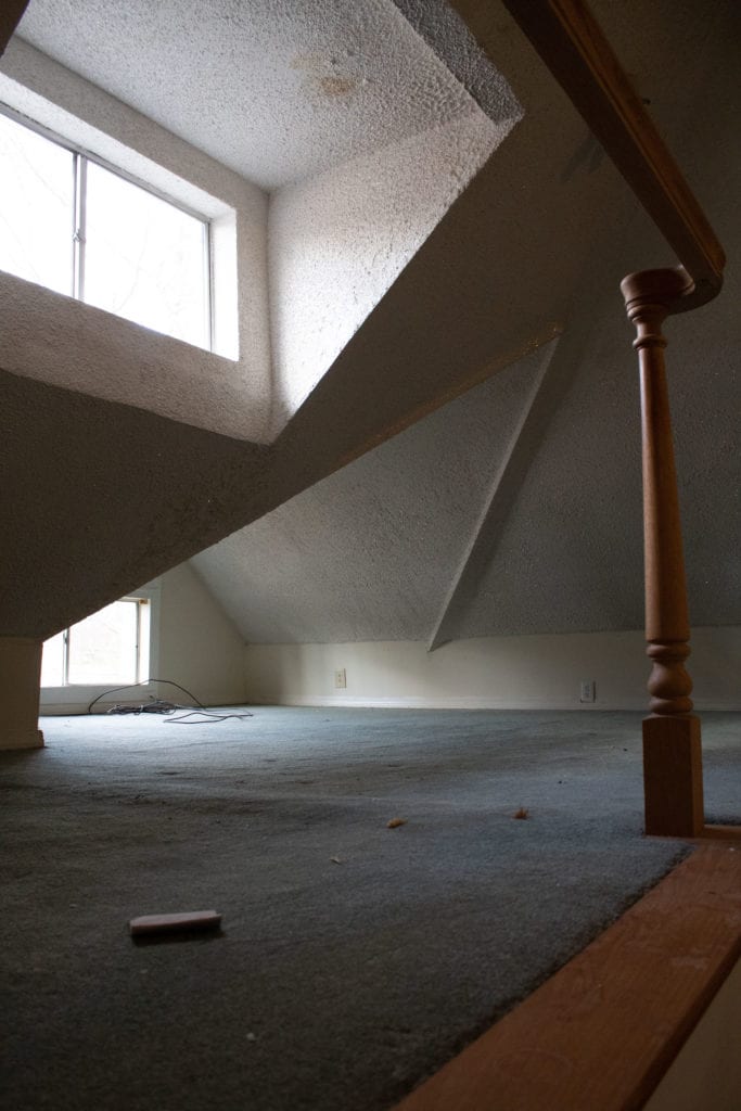
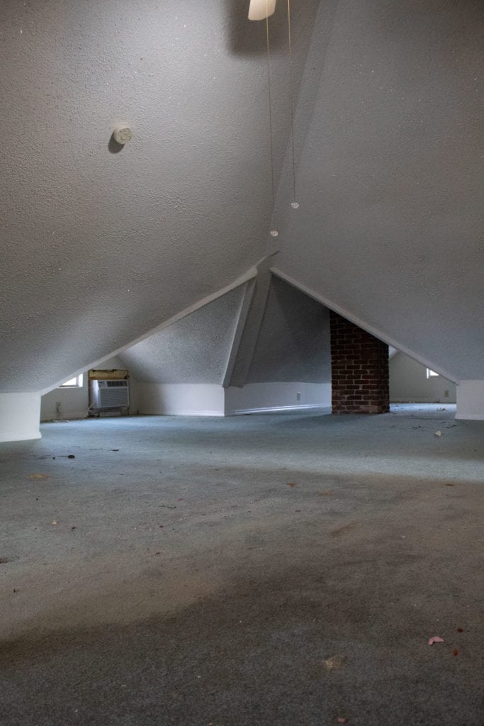
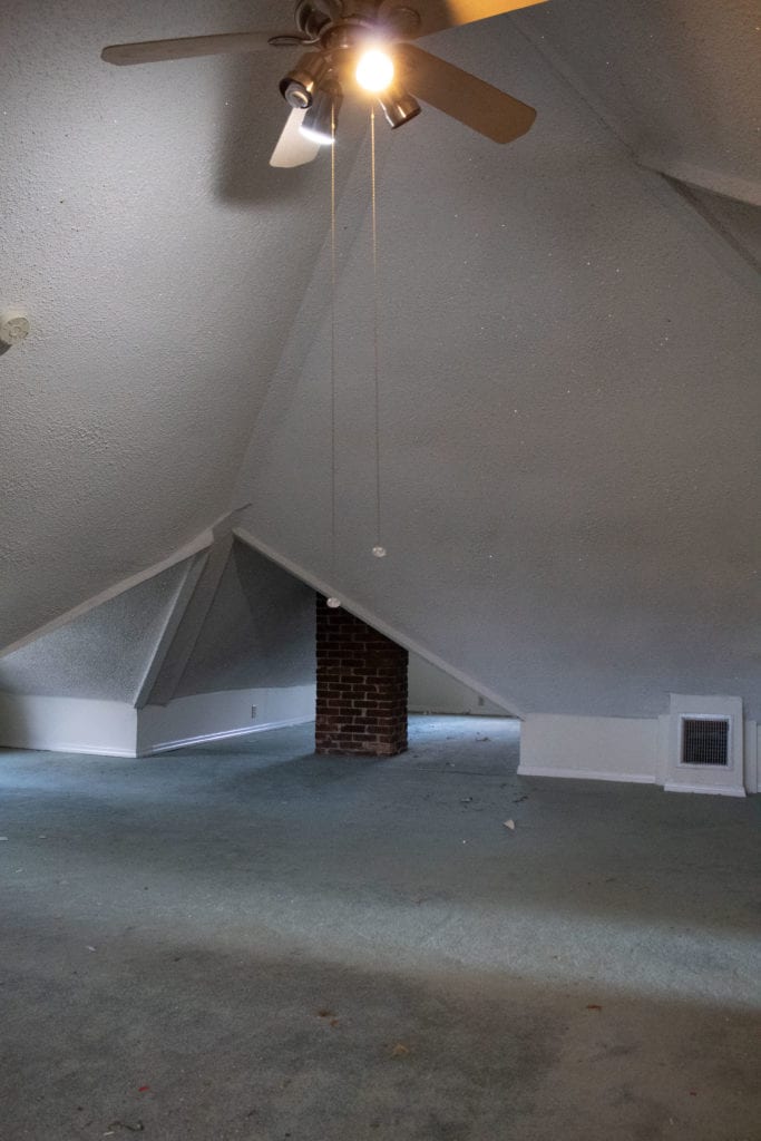
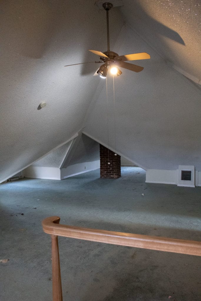
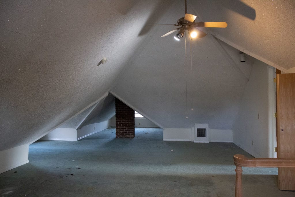
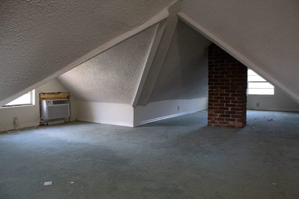
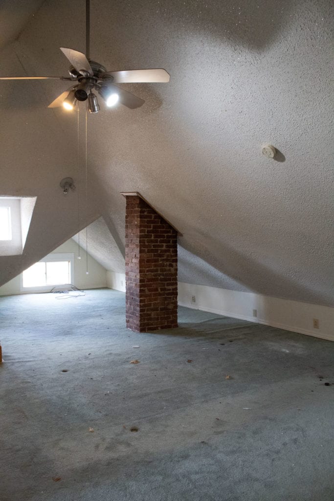
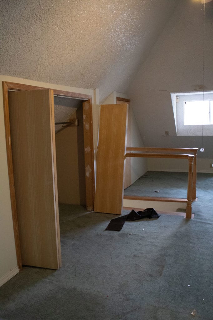
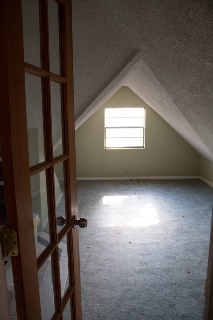
The entire upstairs is currently the primary bedroom suite, but with no straight walls, it’s nearly impossible for any furniture to feel grounded up here. We’ll be expanding this space out the back into dormers, and turning this into two large bedrooms with a jack-and-jill bathroom between. I’m sure our subcontractors will be happy we’re not keeping this so they don’t have to scrape all of this glittery popcorn texture off the ceilings.
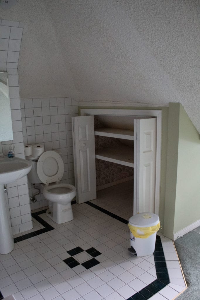
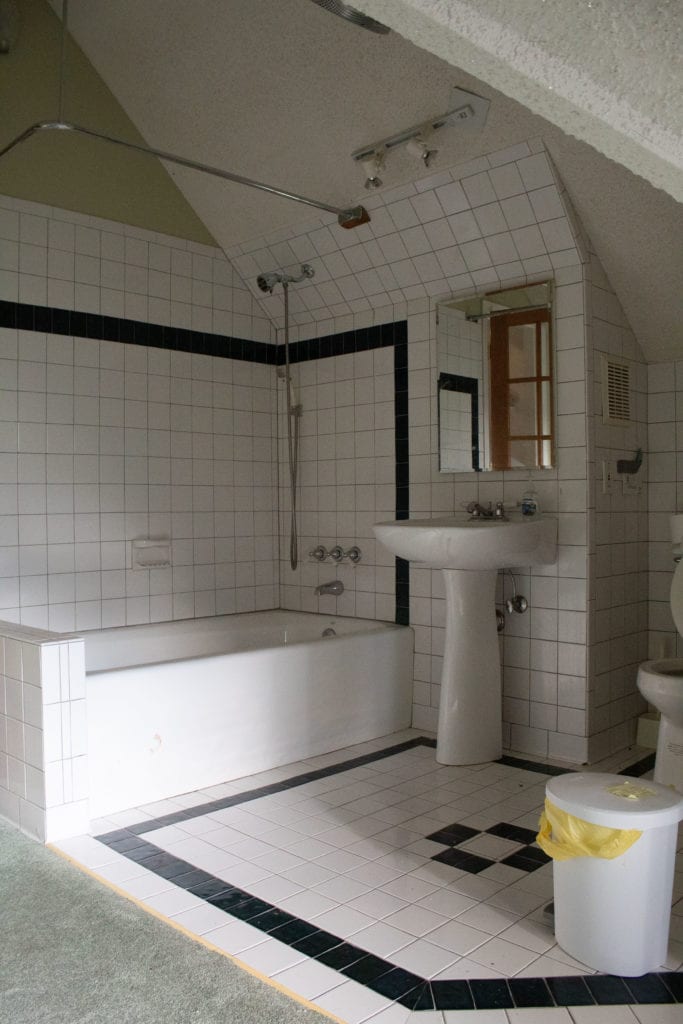
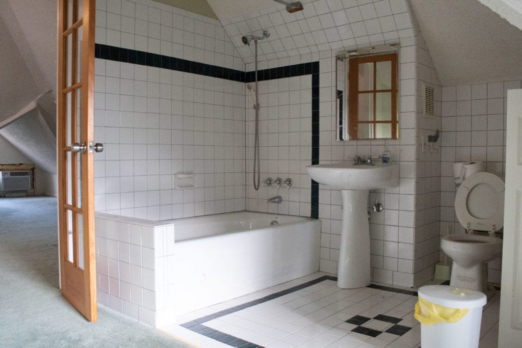
Now for one of the weirdest bathrooms ever designed. All tucked into the corner. And yes, BOTH bathrooms have windows into them from the rooms adjacent. Green carpet really makes this one unique, though. This will all be ripped out and turned into a dormer in one of the bedrooms.
I hope you’ve enjoyed this little tour, and I hope you’ll stick around to see the Ruby House transform!
Grace
Leave a Reply Cancel reply
For even more content, sign up for my newsletter. I share weekly recaps so you won’t miss anything, as well as personal notes and answers to your questions. Sign up here! I promise I’ll never sell your information or spam you with unsolicited emails.

A Senate Republican has reintroduced a bill specifically focused on resuming and completing the construction of the U.S.–Mexico border wall. Supporters believe that restarting construction will boost national security and help control illegal crossings along unfinished sections.